
I recently saw Izzah’s Pinterest boards, and the first thing I noticed was how different each one felt. One was soft and pastel, another was darker and moodier, and another had this very specific mix of cute cafés, character merch, and desserts that somehow made sense together. Each board had its own personality, even when some of the photos looked similar at first glance.
That made me think about café menus in Singapore, because somehow they are doing the opposite.
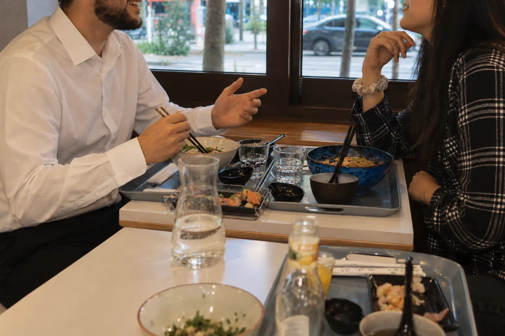
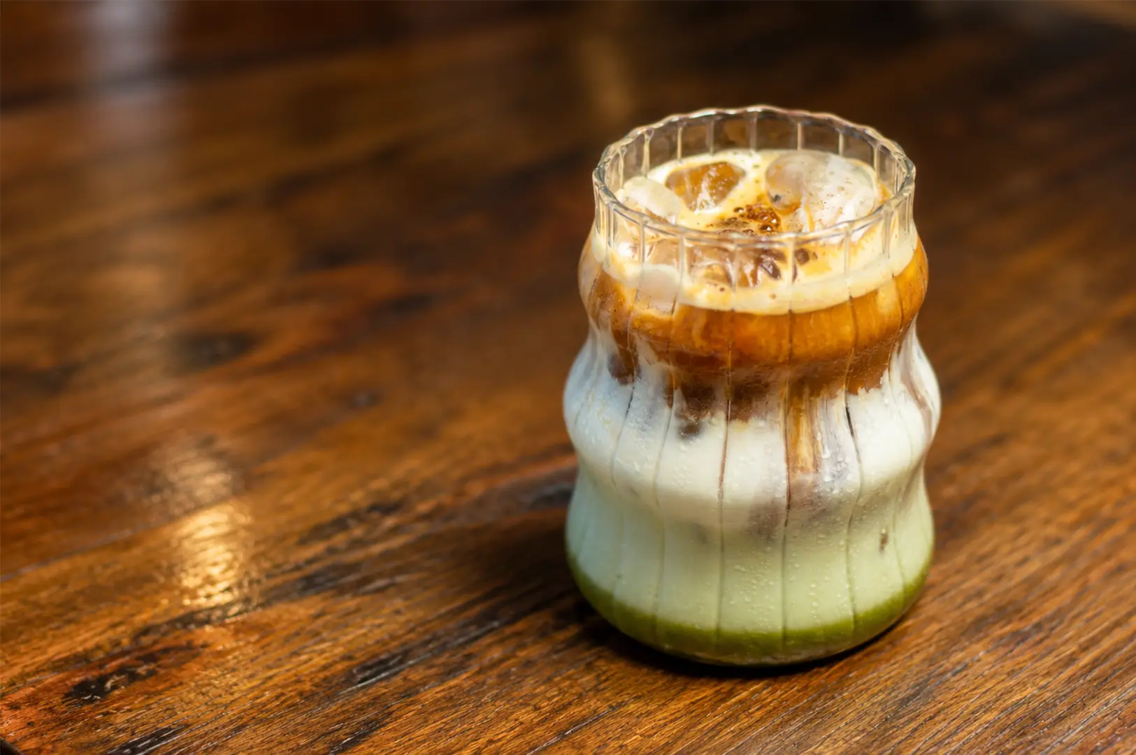
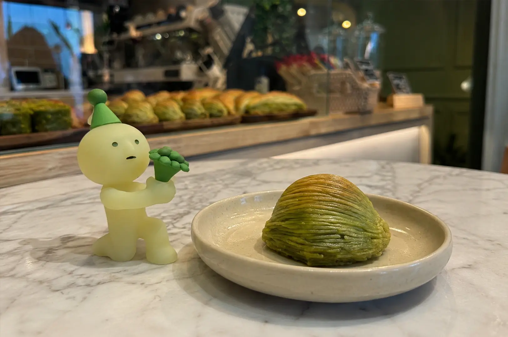
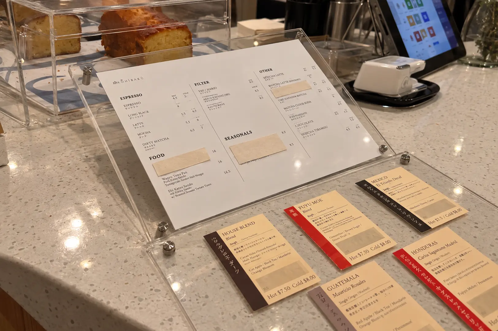
Izzah dragged me into enough new cafés and I start seeing the same lineup. Burrata toast, truffle fries, matcha lattes, tiramisu, and one pastry designed mainly to look good in photos. The interiors may change. One place uses chrome and concrete, another goes for warm wood and cream walls, and another adds a few handmade ceramics. But once you open the menu, it feels like you have seen it before.
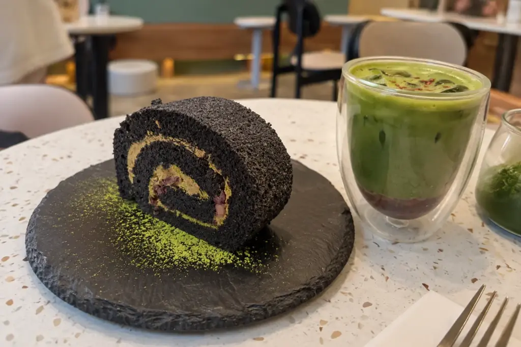
To be fair, these dishes are popular for a reason. Burrata looks generous, matcha has a loyal audience, truffle fries are easy to share, and tiramisu is familiar enough to sell without much explanation. From a business point of view, it makes sense to include items people already recognise and search for online.
The problem is that safe choices have started replacing identity.
A café can look completely different from the one next door, yet still serve the same five things with slightly different plating. One adds hot honey to the burrata. Another serves the tiramisu in a metal tray. Another gives the matcha latte a strawberry layer. The details change, but the structure stays the same.
That is probably why some café visits blur together now. I remember the table, the cup, and the lighting better than the food. The menu feels designed around what photographs well, not necessarily around what the café actually wants to say.
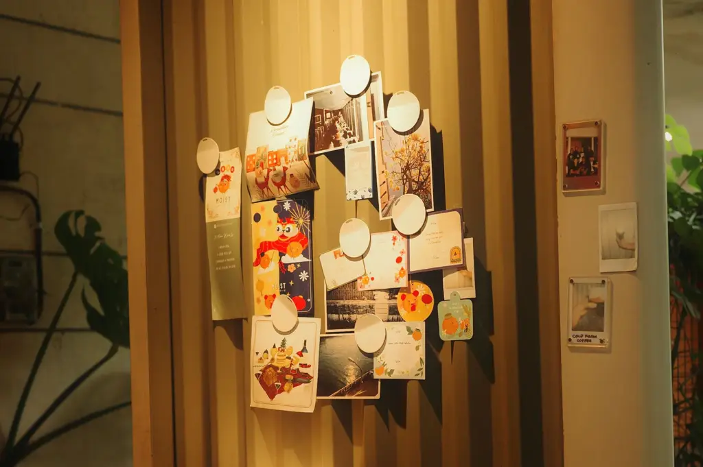
This is where I think cafés could learn something from Izzah’s Pinterest boards. A strong visual identity is not just about collecting pretty things. The best boards have a point of view. They show what someone likes, what mood they are drawn to, and what makes their taste different from everyone else’s.
A café menu should do the same.
It does not need twenty experimental dishes or ingredients nobody can pronounce. It just needs a clearer personality. Maybe the owner grew up eating a specific breakfast and wants to reinterpret it. Maybe the pastry programme focuses on one regional flavour. Maybe the drinks reflect the neighbourhood instead of whatever is trending that month.
People notice when a place has conviction. They also notice when a menu feels assembled from popular search terms.
I am not asking cafés to remove matcha or tiramisu. I still order both. But I would like to know why this café’s version exists, beyond the fact that other cafés are selling it too.
A beautiful menu can get people through the door. A distinct one gives them a reason to remember where they went.
Click here to discover more food culture hot takes on Social Eats N Drink.